01
Match the video, don't out-promise it
A dramatic thumbnail over a flat video buys a click and loses the viewer in four seconds, which most platforms punish harder than a lower click-through rate. Generating both in one style keeps the gap small.
Click-through work
A thumbnail's job is to promise accurately. Generating it in the same style as the video means the promise and the payoff look like the same thing — which matters more for retention than it does for the click.
Built for
YouTube creators · Shorts and Reels creators · Course creators · Marketers
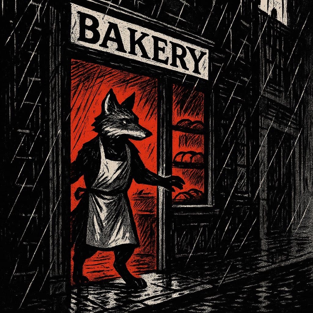
The practical difference
Thumbnails in your video's own visual language, at the aspect ratio you actually publish in.
What the workflow helps you do
01
A dramatic thumbnail over a flat video buys a click and loses the viewer in four seconds, which most platforms punish harder than a lower click-through rate. Generating both in one style keeps the gap small.
02
Choosing 16:9 or 9:16 before generating means the subject is composed for that frame. Cropping a square afterwards throws away the compositional decisions that made it work.
03
At one credit past the free quota, generating three candidates and picking one is a reasonable habit rather than an indulgence.
A better starting point
Use this as a planning sequence, not a rigid formula. The goal is to make the creative and editorial decisions before rendering so that the generated scenes have a clear job to perform.
Read the thumbnail guide ↓A face, an object, or a contrast — thumbnails are read at small size, so one element has to survive that.
16:9 for standard video, 9:16 for Shorts and Reels.
View the candidate at thumbnail size before deciding. Most fail there, not at full size.
Editorial guardrails
Generated lettering is unreliable. Leave deliberate empty space in the frame and add text in an editor where you control the typeface.
Platform compression flattens subtle tonal work. Strong value contrast is what remains legible in a crowded feed.
Use this as a starting brief
“A startled fox looking at a burnt loaf of bread, bold contrast, empty space on the right for a title”
Adapt the audience, platform, character, story change, and visual style. The more the brief reflects your own format, the less the finished video will feel interchangeable.
Try it now
No account, no card. Sign up afterwards and the image you made is saved to your account, along with the rest of your three free images this month.
Continue learning
Most thumbnails are judged at full size and consumed at postage-stamp size. That gap is where they fail.
Read the guide →The retention cost of a thumbnail that promises something the video doesn't deliver — and why generating both in one style avoids it.
Read the guide →A generated frame from your video is rarely your best thumbnail. Here's how to think about thumbnails as a separate design problem.
Read the guide →A 2,000+ word operating guide for building an original faceless YouTube channel with a repeatable editorial format and AI-assisted visual production.
Read the guide →Anime and claymation sit at opposite ends of the AI video style spectrum. Here's how to pick between them based on niche, story type, and production tradeoffs.
Read the guide →Watercolor and Pixel Art sit at opposite ends of the style spectrum. Here's a practical breakdown of which niches and content types each one actually fits.
Read the guide →Related workflows
Frequently asked questions
Generate at 16:9 for standard video or 9:16 for vertical; both are produced at usable resolution for platform upload.
Add text afterwards in an editor — generated lettering is unreliable, so leave space for it in the frame.
It draws from the same three free images a month, then one credit each.
Start with an idea worth finishing.
Give the prompt a point of view, a viewer, and a clear final beat. The rest of the workflow becomes far easier to shape.